building a design system for Affinidi's privacy- preserving applications
A design system is crucial for ensuring consistency, efficiency, and scalability in digital product development. By providing a collection of reusable components and standardised guidelines, it creates a unified visual language and cohesive user experience across different platforms and products.
This not only streamlines the design and development process, reducing redundancy and errors, but also enhances collaboration among teams
Ultimately, a robust design system enables organisations to innovate faster and deliver high-quality products that meet user needs and expectations.
For our design system we used the Atomic Design approach. Atomic design is a methodology composed of five distinct stages working together to create interface design systems in a more deliberate and hierarchical manner. The five stages of atomic design are:
Atoms
Molecules
Organisms
Templates
Pages
design system
design handover
design leadership
responsive design
ux design
ui design
web 3.0
prOject dEtails
key responsibilities
COMPANY
affinidi
role
lead product designer
date
2022-2023
link
www.affinidi.com
Two years after launching Affinidi, we had developed a diverse array of products. Our Berlin team created some, our Singaporean team crafted others, and we built additional products for clients.
Our goal was to unify these varied offerings into a cohesive suite within our developer portal. Naturally, each product had its own distinct look and feel, creating the need for a new, overarching design system.
Integrating these different products into a single, cohesive entity was a significant challenge.
the chAllenge
my rOle
As the Lead Designer on this project, my role was to unify all the diverse products. Having contributed to most of these products in some capacity, I was responsible for harmonising the user experience in the final product.
Additionally, I led the team in designing and developing the various components of the design system and managed the handover to the developers who were building it.

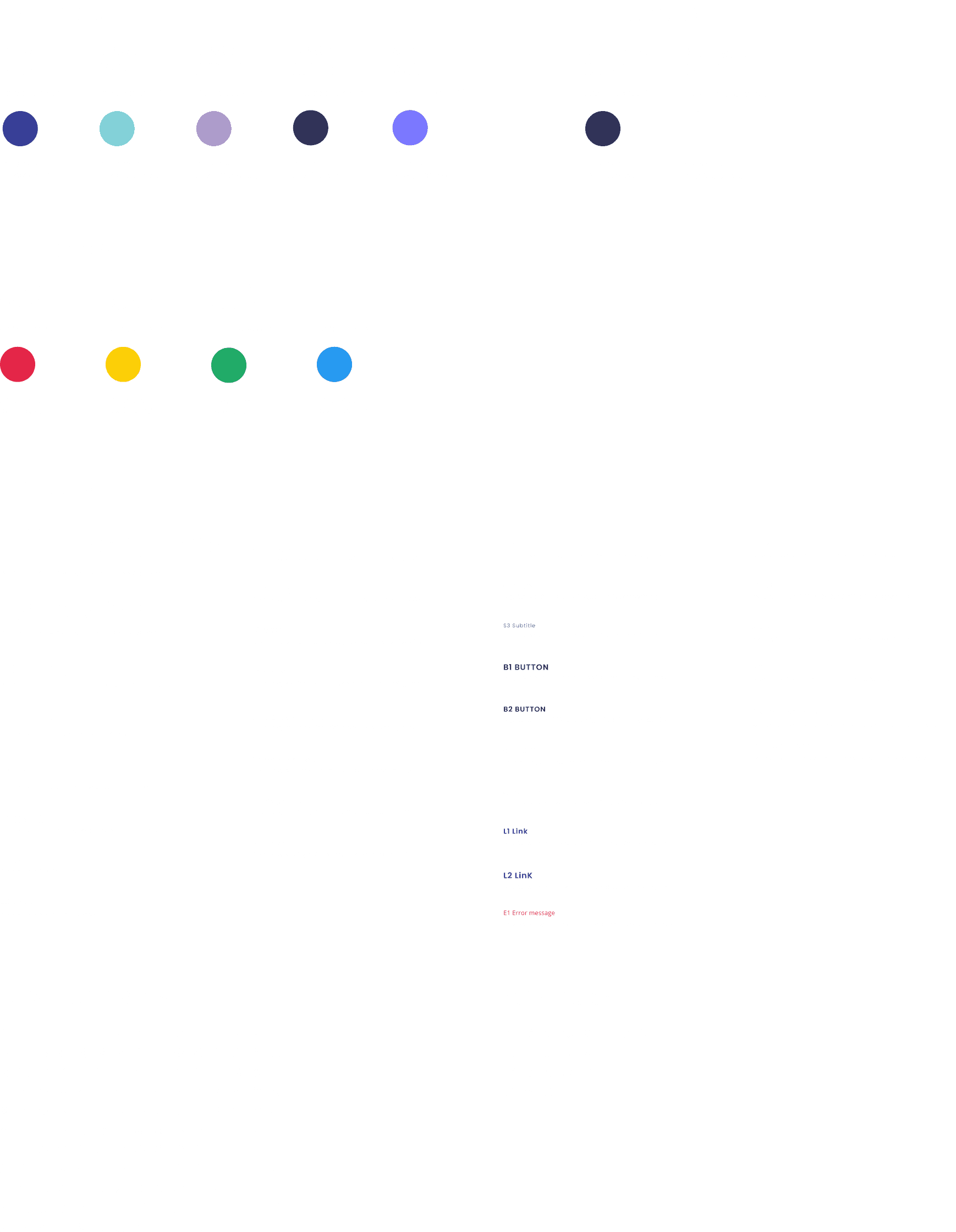
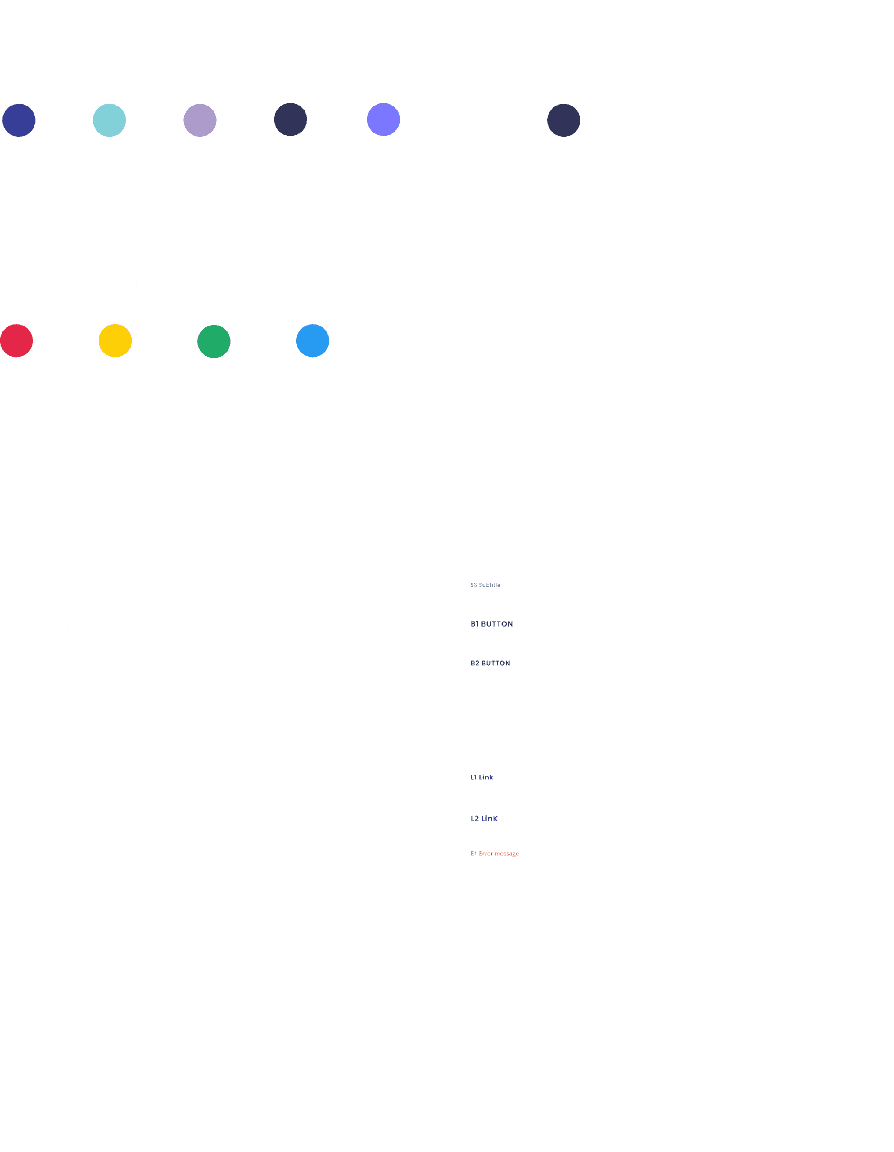
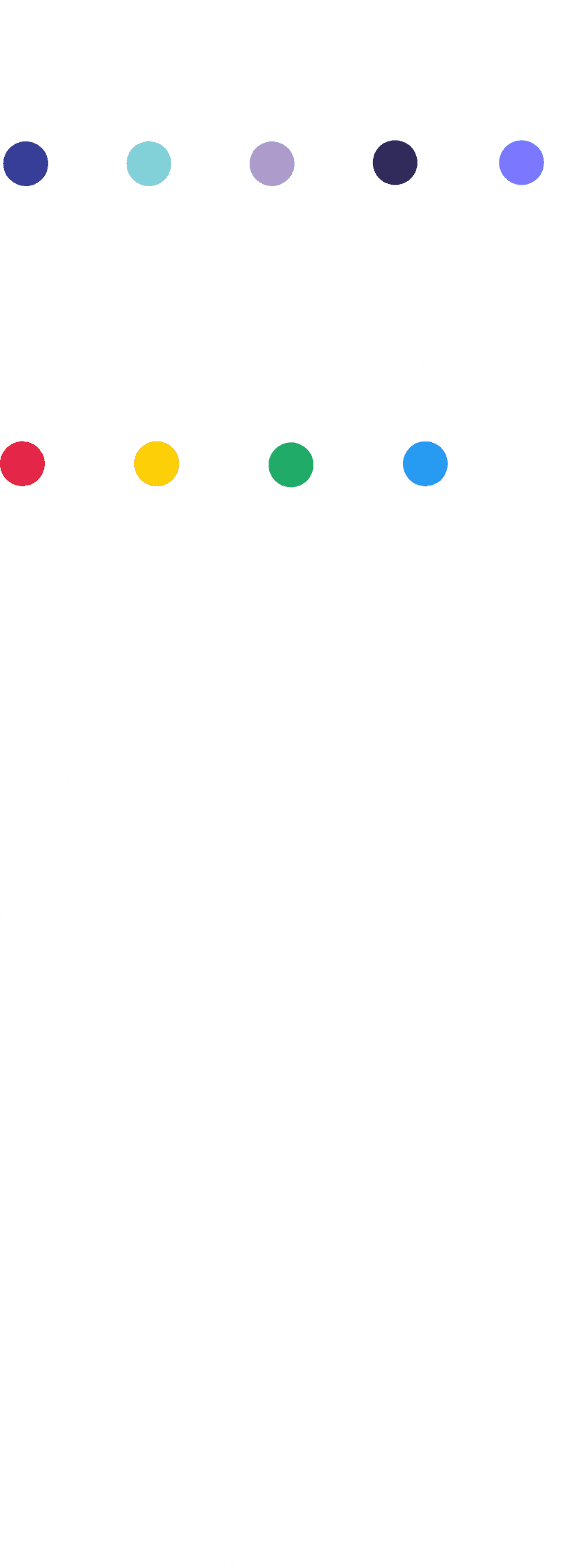
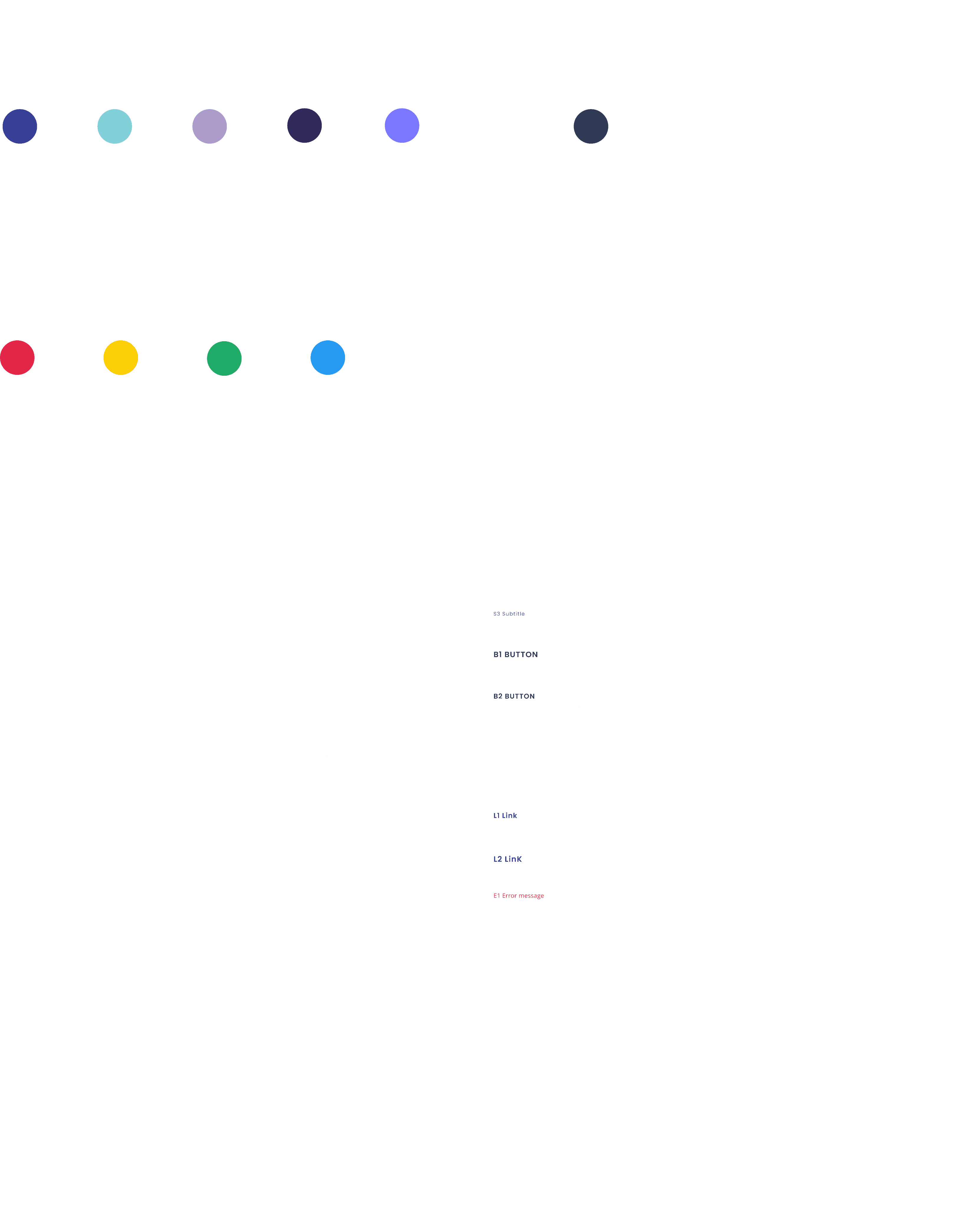
stYleguide
text styles
RGBA (39, 154, 241, 1)
HEX #279AF1
Utility_info_100
utility
info
RGBA (33, 171, 104, 1)
HEX #21AB68
Utility_success_100
utility
success
RGBA (252, 207, 7, 1)
HEX #FCCF07
Utiliy_warning_100
utility
warning
RGBA (228, 38, 72, 1)
HEX #E42648
Utility_danger_100
utility
danger
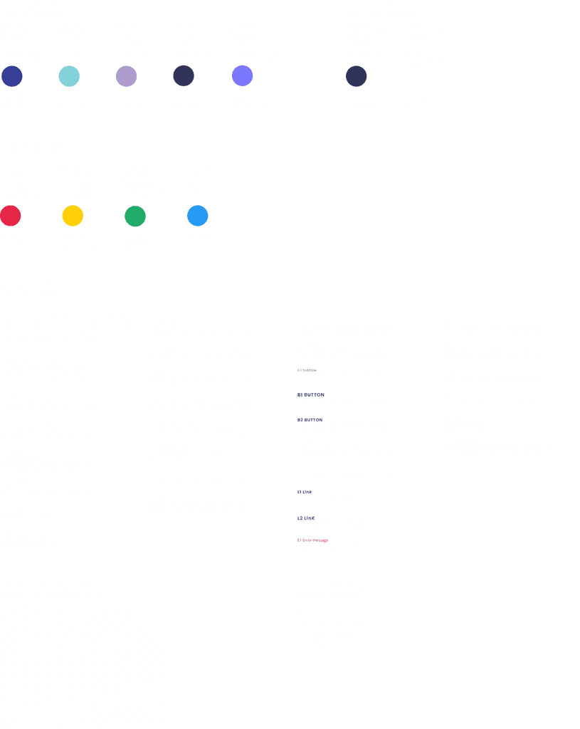
brand colors
utility colors
neutral colors
molecUles
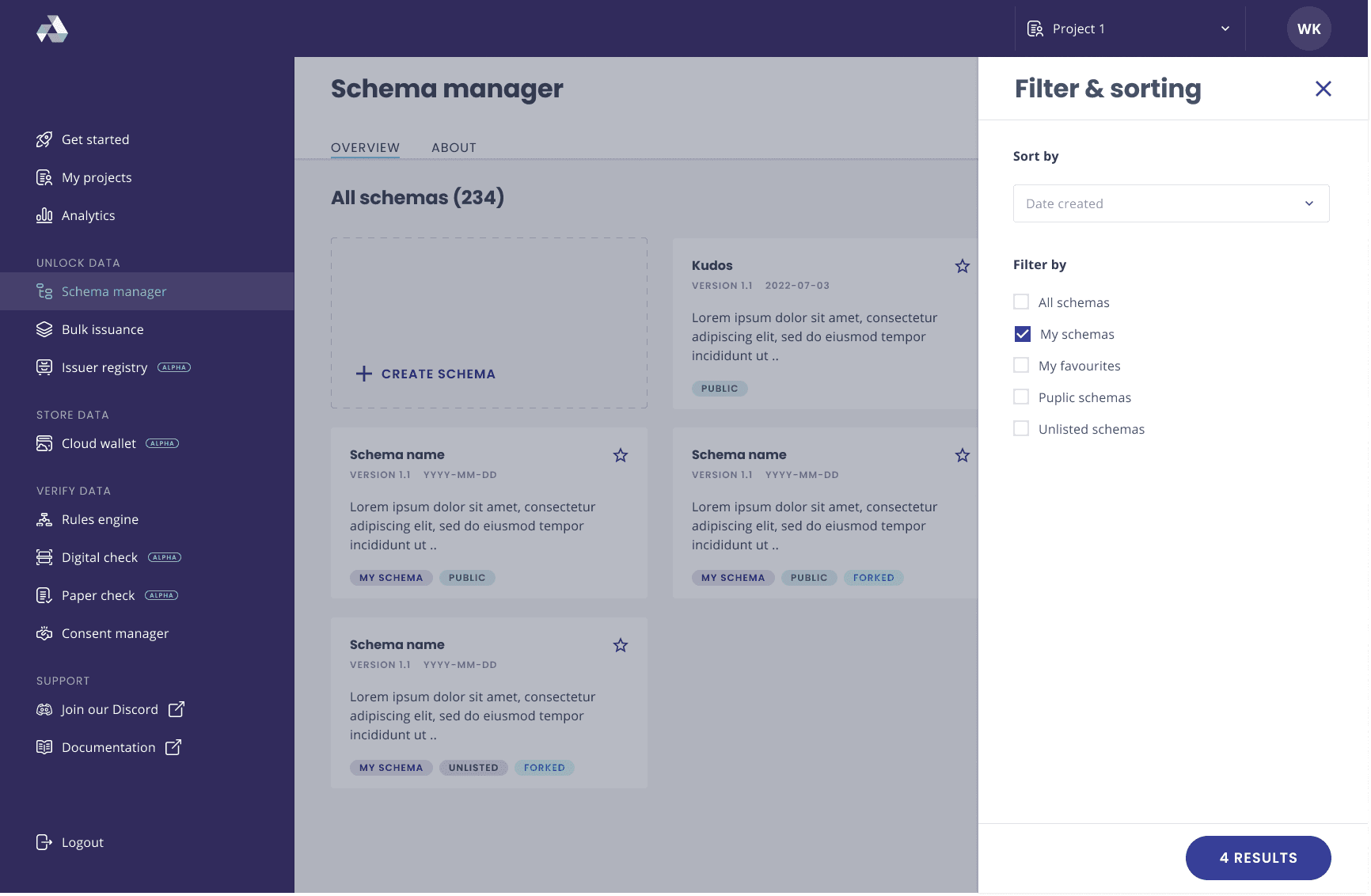
Molecules can be created by combining two or more atoms. For instance, an input field and a button can combine to become a search form - below is a selection of molecules from our design system.
The style guide below served as the foundation for our design system. While most elements were predefined, additional elements were incorporated as needed.
Organisms
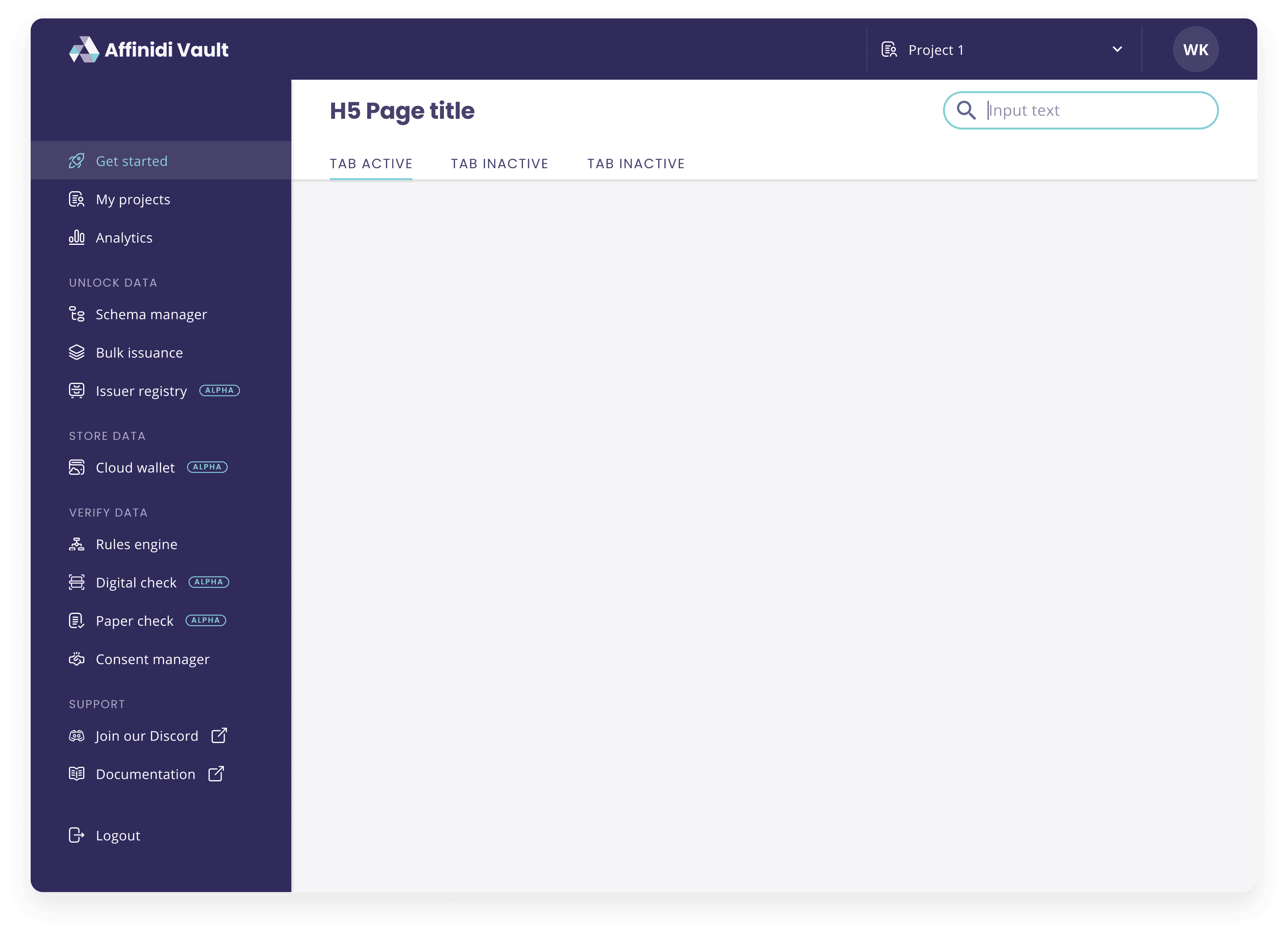
Multiple molecules together form an organism - examples of an organism are for example, a header, sidebar or signup form.
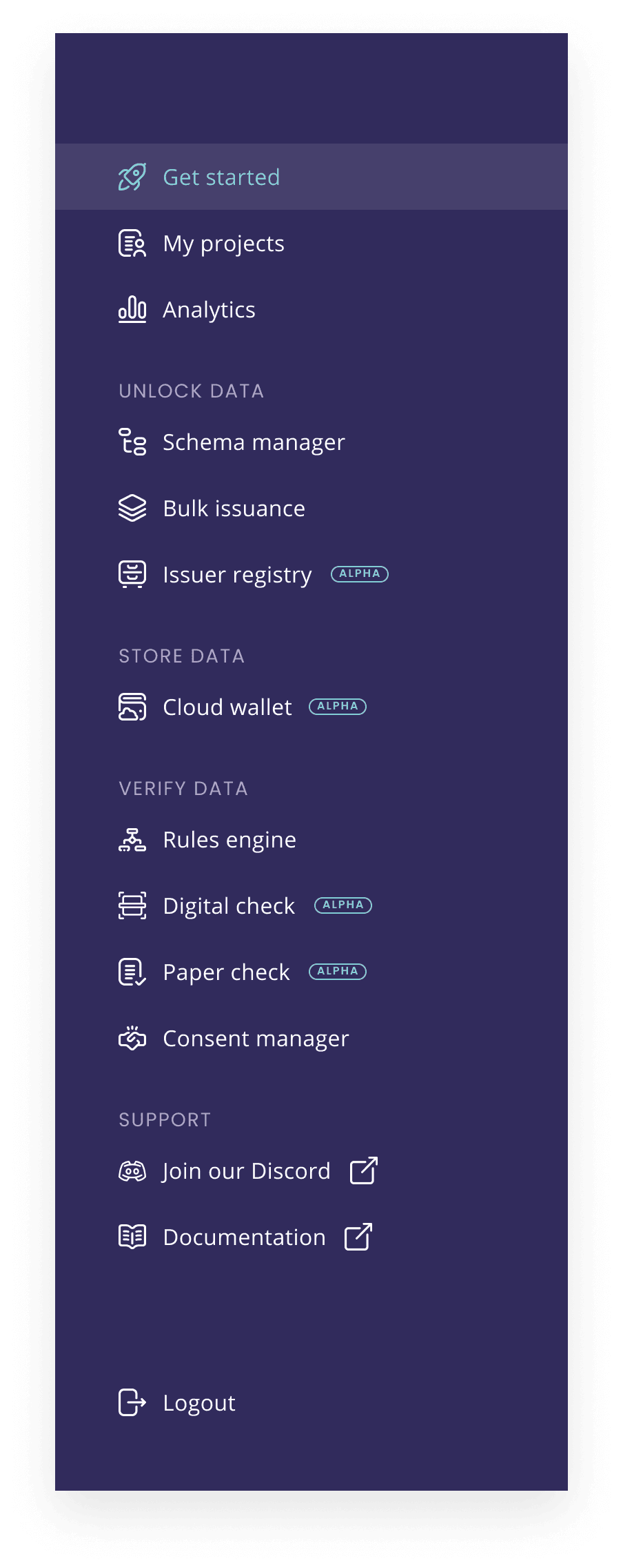

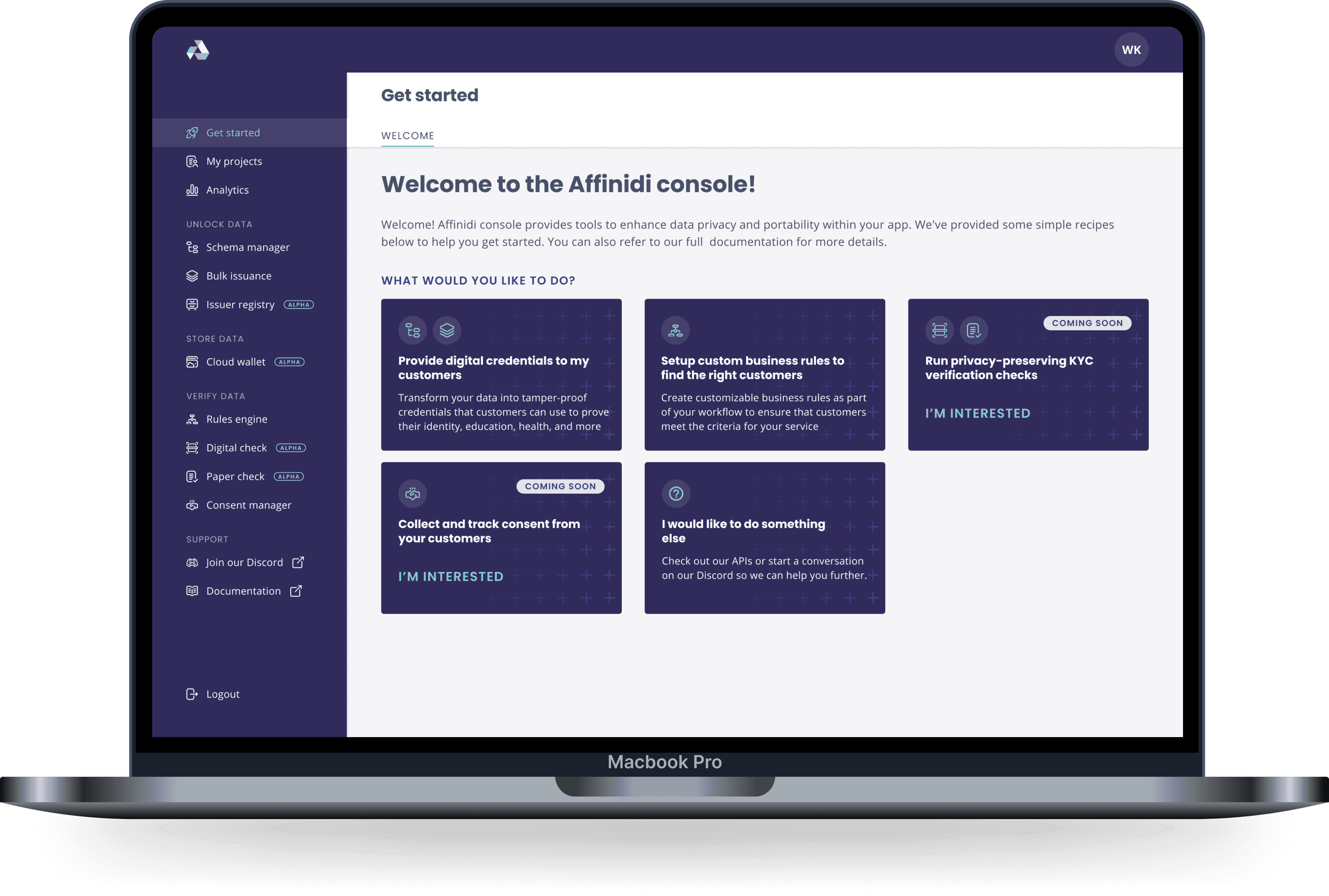
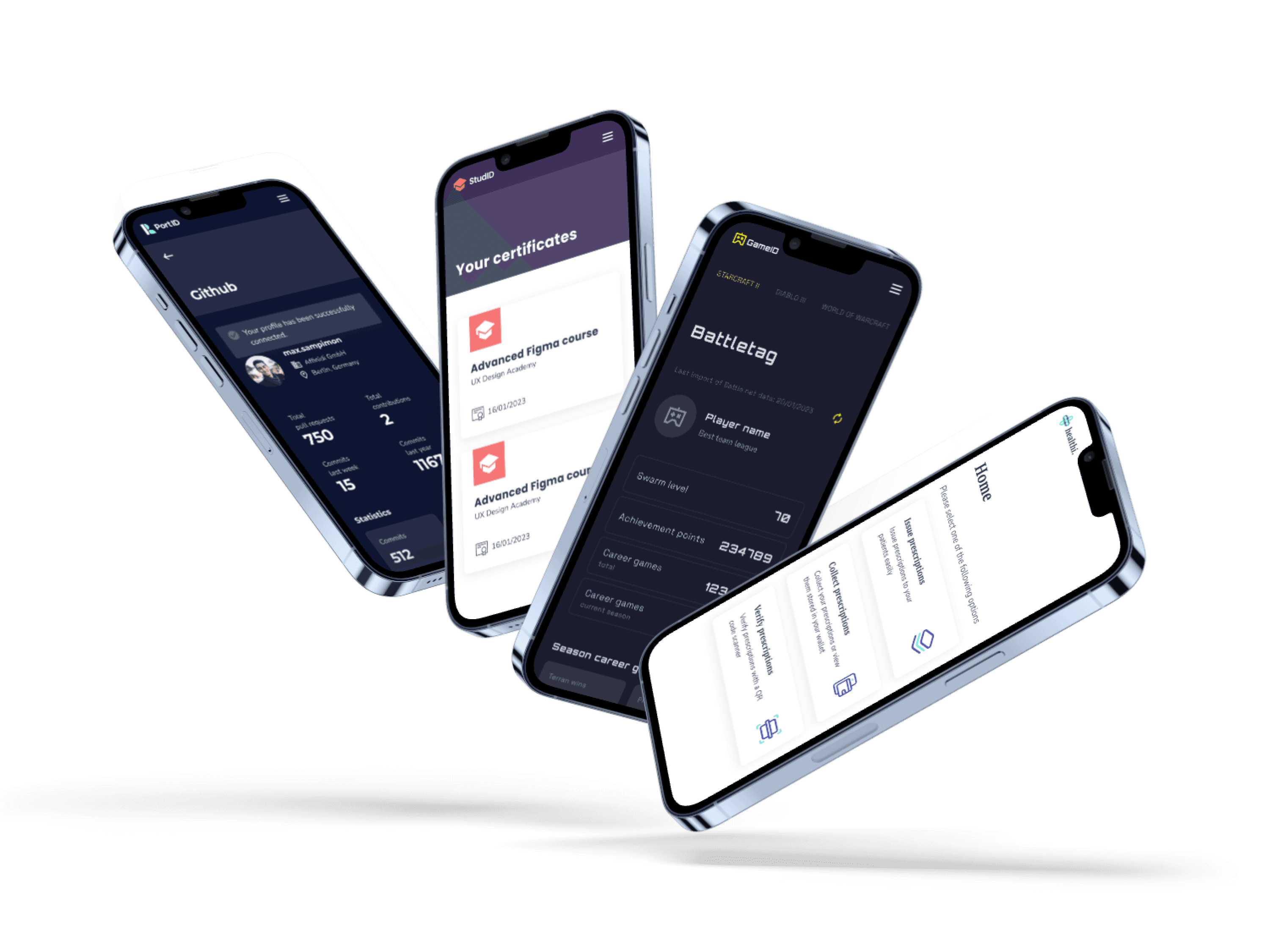
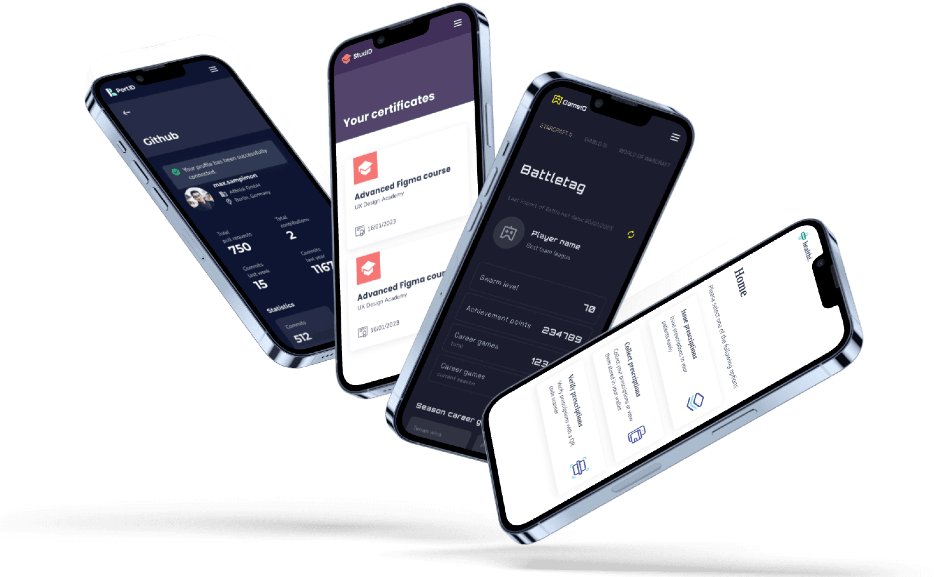
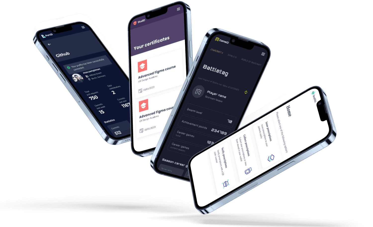
Applications
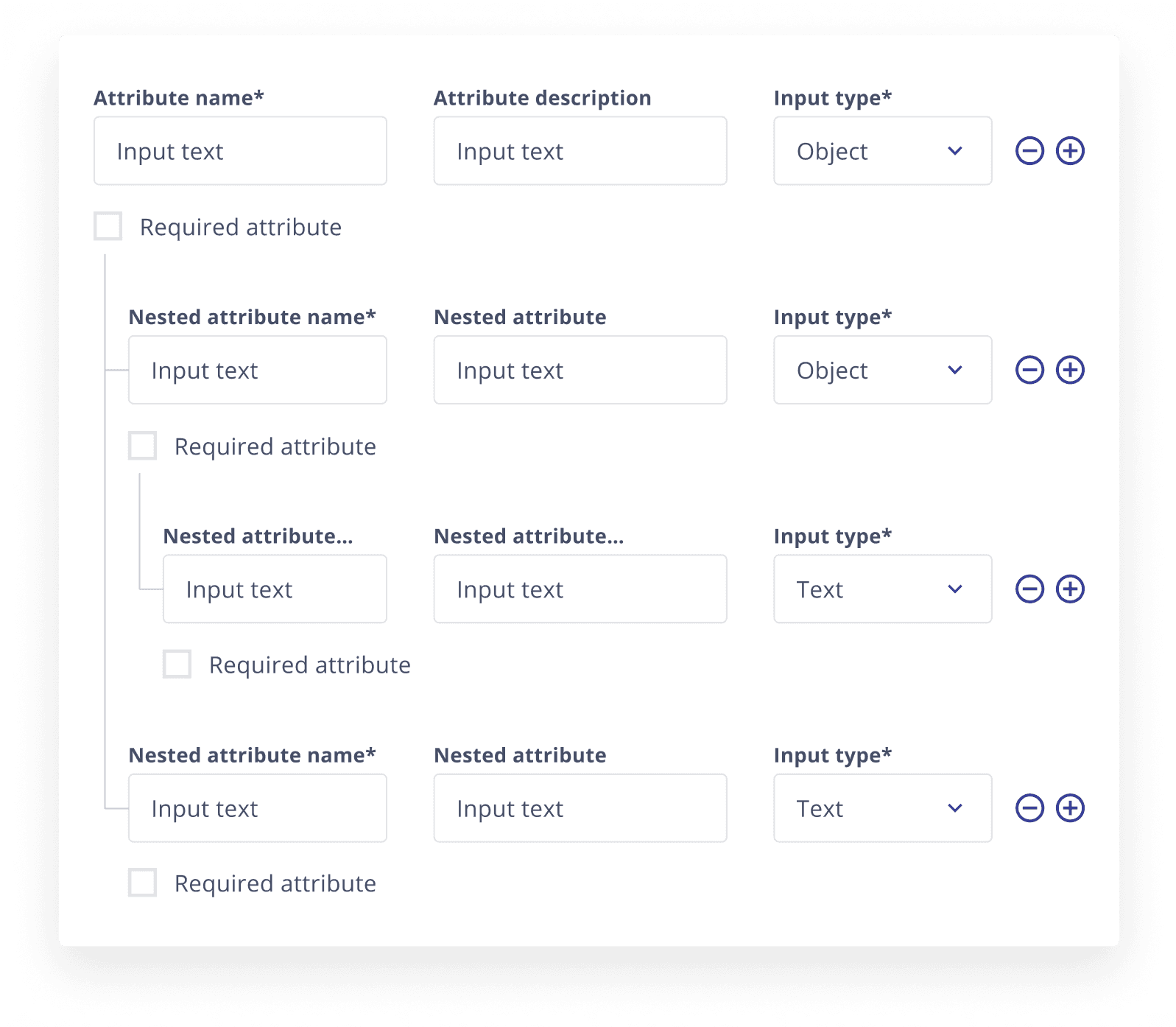
developer console
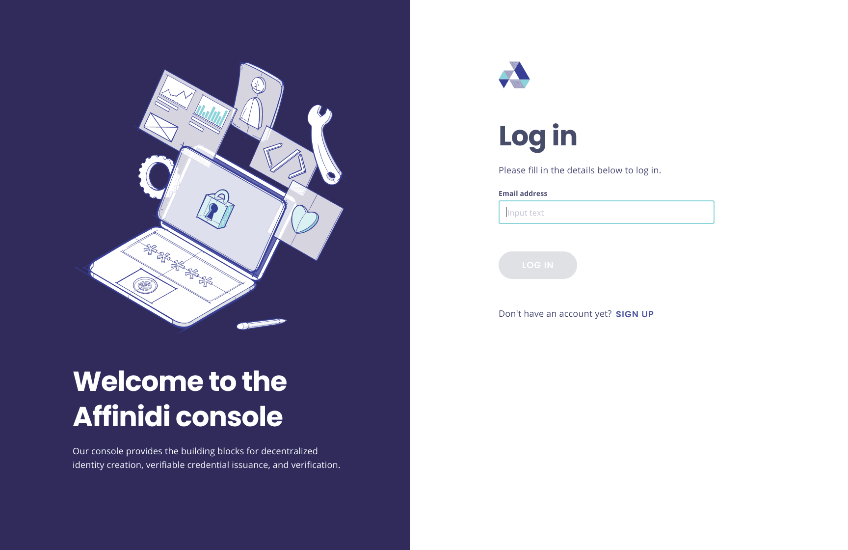
This design system was originally created for our developer console. The developer console provides tools to enhance data privacy and portability within the applications of our customers.

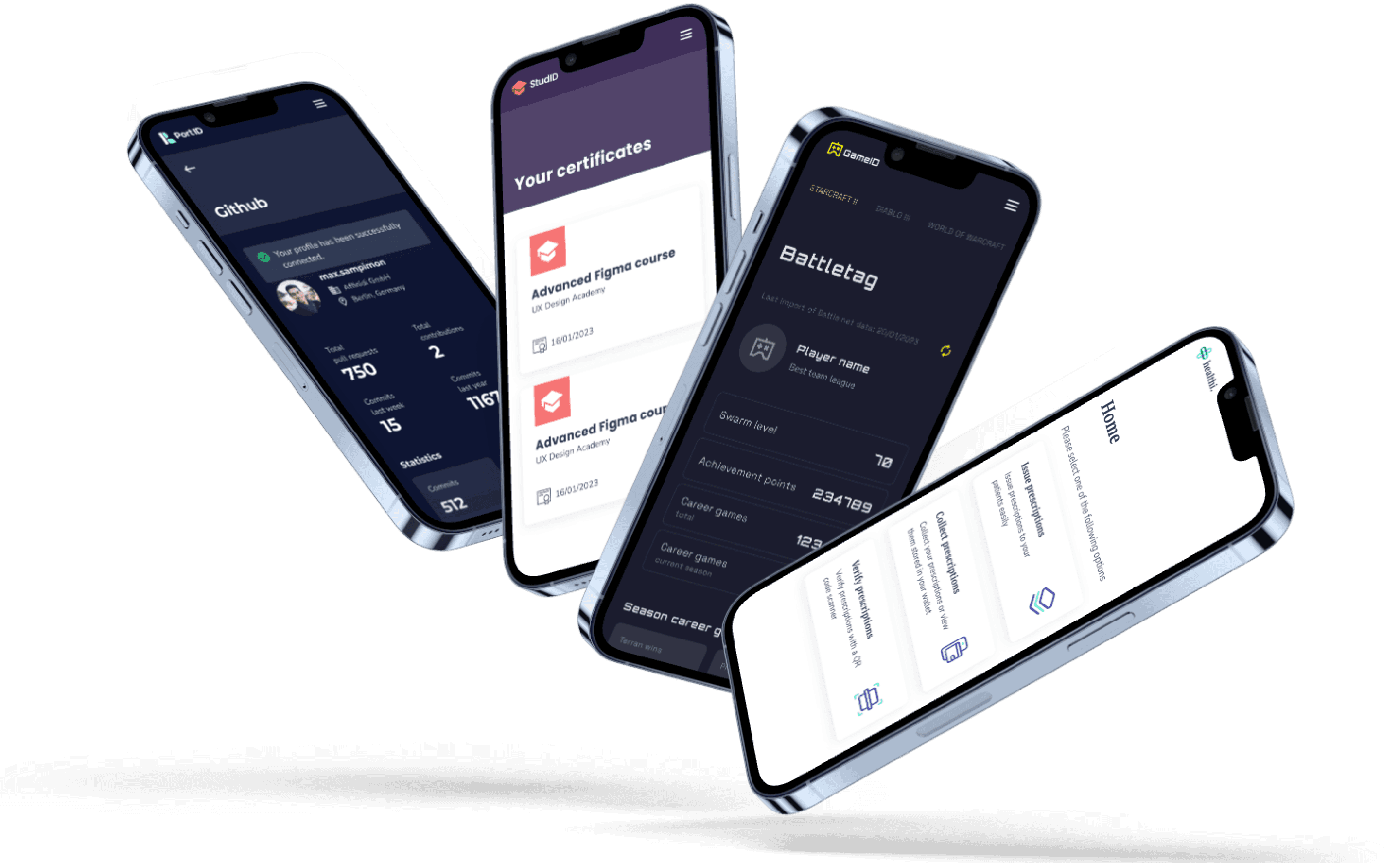
white label credential applications
The flexibility of the design system enabled us to reuse it across various applications.
By duplicating the design system and updating the style guide to create a unique look and feel, we significantly reduced the time required to build new applications.


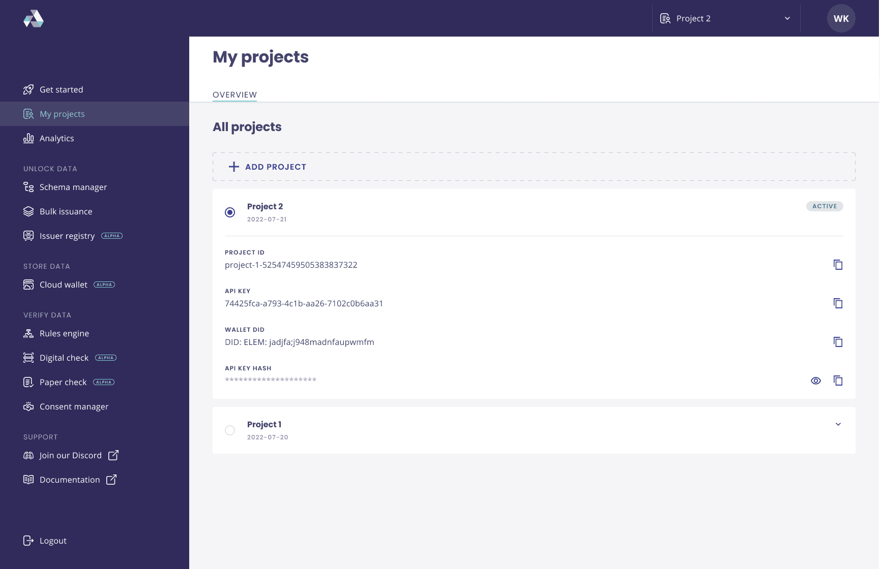
pAges
The highest lever of hierarchy in an atomic design system are the actual pages which makes a product. Below are selection of the pages of our developer portal.
buying a second-hand car has never been easier with heycAr
Heycar is the place to buy your next car the feel good way. It was created with car buyers in mind, whether you know exactly what you want, or need a little more help deciding, heycar is here to help you find the one.
Heycar makes it easier to find a car a buyer can rely on. They only have the best quality cars from selected dealers, and have a great range of cars from all the big manufacturers, so you can get straight to the best ones. All of the cars are quality checked and come with a warranty to give complete peace of mind.
They’ve also got less than 100,000 miles on the clock and are under 8 years old, meaning you can drive away with confidence. And to show you we’re serious about quality, we offer a 10-day money back guarantee too.
prOject dEtails
client
volkswagen financial services
role
senior product designer
date
2018-2018
link
www.hey.car
www.heycar.co.uk
key responsibilities
ux design
ui design
prototyping
design leadership
user research
usability testing
the chAllenge
A lot of people feel lost when it comes to buying a second-hand car. During our research we identified 4 major pain points when it comes to the buying process:
Buyers often feel overwhelmed when buying a second hand car
They often feel inadequate to judge whether a car is a good buy
They find it difficult to bargain for a good price
It's difficult to get a good financing for second-hand cars
WIth heycar we aimed to make the buyer more confident when it comes to buying a second-hand car.
my rOle
I was involved in this project from start to finish as Senior Designer.
I designed the concept designs that were part of the pitch to the client as well as the final designs for the financing calculator and the dealer portal.
After the success of heycar Germany, I was asked to lead the design team for heycar UK.
building a design system for Affinidi's privacy- preserving applications
A design system is crucial for ensuring consistency, efficiency, and scalability in digital product development. By providing a collection of reusable components and standardised guidelines, it creates a unified visual language and cohesive user experience across different platforms and products.
This not only streamlines the design and development process, reducing redundancy and errors, but also enhances collaboration among teams
Ultimately, a robust design system enables organisations to innovate faster and deliver high-quality products that meet user needs and expectations.
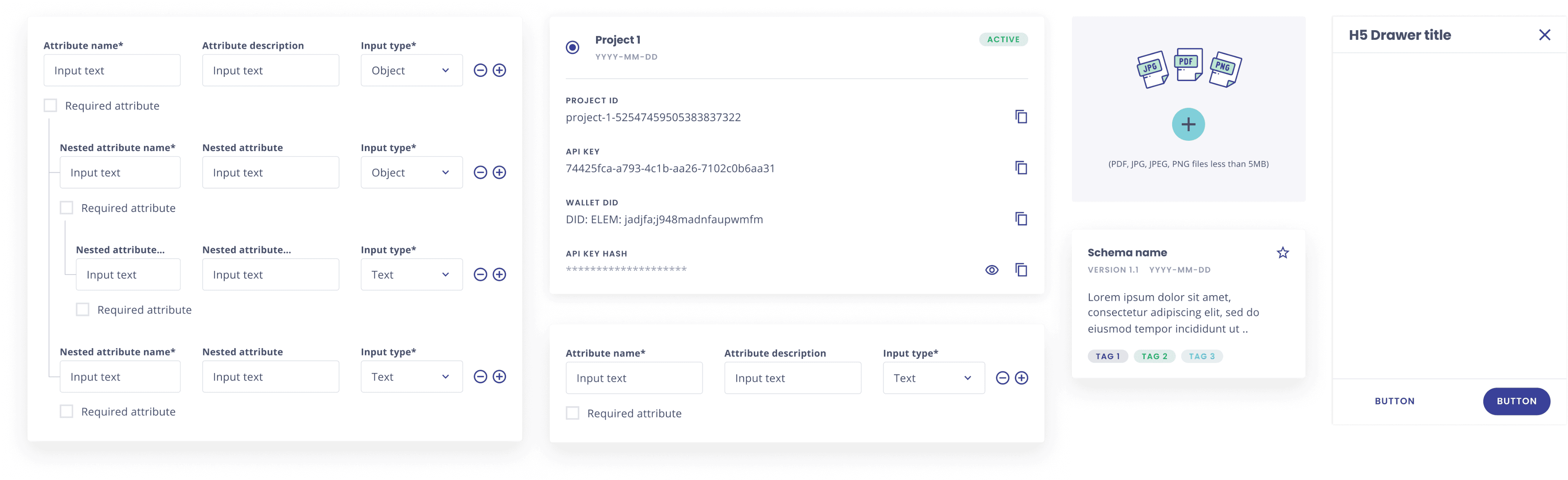
For our design system we used the Atomic Design approach. Atomic design is a methodology composed of five distinct stages working together to create interface design systems in a more deliberate and hierarchical manner. The five stages of atomic design are:
Atoms
Molecules
Organisms
Templates
Pages
prOject dEtails
client
affinidi
role
lead product designer
date
2023
link
www.affinidi.com
key responsibilities
ux design
ui design
design system
design leadership
user research
responsive design
web 3.0
the chAllenge
Two years after launching Affinidi, we had developed a diverse array of products. Our Berlin team created some, our Singaporean team crafted others, and we built additional products for clients.
Our goal was to unify these varied offerings into a cohesive suite within our developer portal. Naturally, each product had its own distinct look and feel, creating the need for a new, overarching design system.
Integrating these different products into a single, cohesive entity was a significant challenge.
my rOle
As the Lead Designer on this project, my role was to unify all the diverse products. Having contributed to most of these products in some capacity, I was responsible for harmonising the user experience in the final product.
Additionally, I led the team in designing and developing the various components of the design system and managed the handover to the developers who were building it.

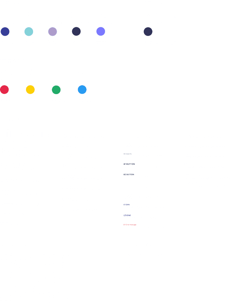
stYleguide
The style guide below served as the foundation for our design system. While most elements were predefined, additional elements were incorporated as needed.
stYleguide
The style guide below served as the foundation for our design system. While most elements were predefined, additional elements were incorporated as needed.
BUTTON
BUTTON
BUTTON
BUTTON
BUTTON
BUTTON
BUTTON
BUTTON
BUTTON
BUTTON
BUTTON
BUTTON
BUTTON
BUTTON
BUTTON
BUTTON
buttons m - variations
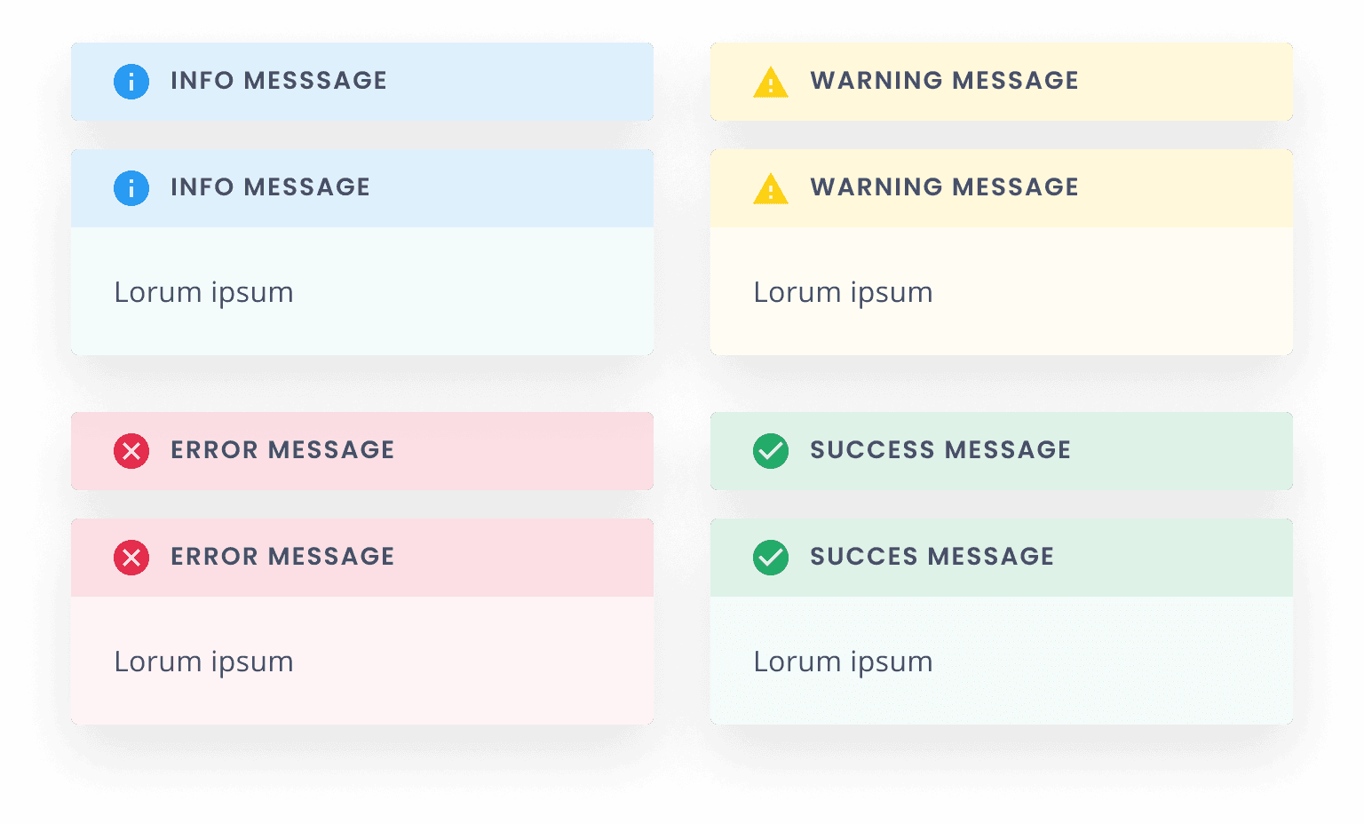
messages
labels
inputs
selects
TEXT
TEXT
TEXT
TEXT
TEXT
TEXT
TEXT
TEXT
TEXT
TEXT
TEXT
TEXT
TEXT
TEXT
TEXT
TEXT
BUTTON
BUTTON
BUTTON
BUTTON
BUTTON
BUTTON
BUTTON
BUTTON
BUTTON
BUTTON
BUTTON
BUTTON

atOms
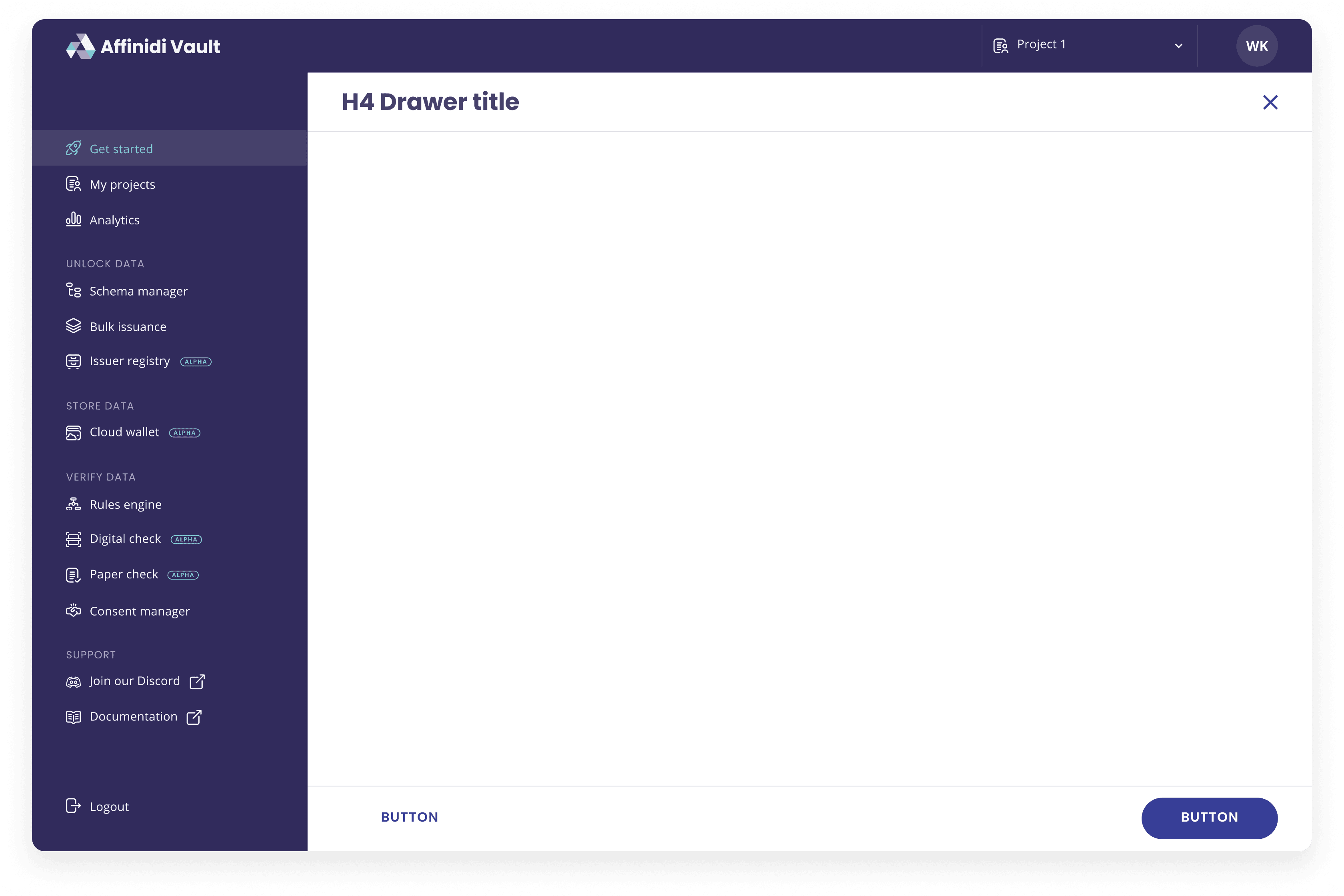
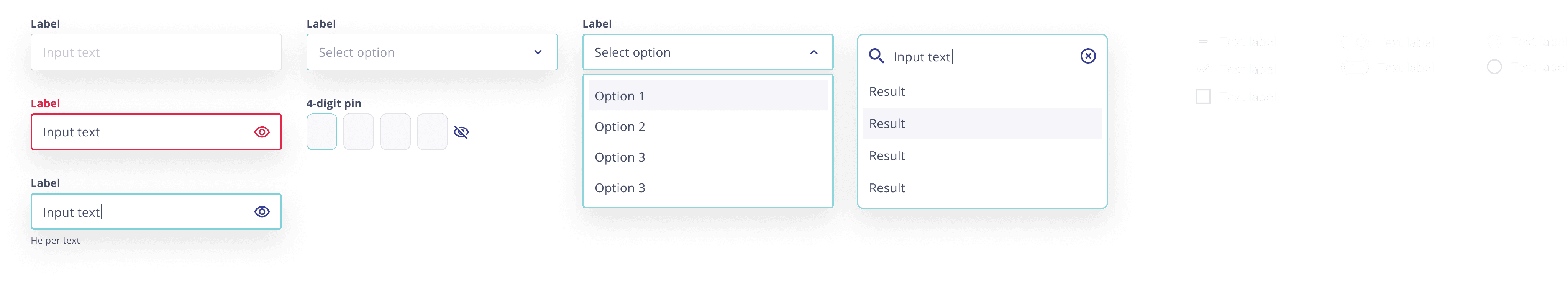
Atoms are the most basic components. They are the building blocks of a design system such as buttons, lines, shapes, icons, text fields, text labels, etc. - this is a selection of the atoms we used in our design system.
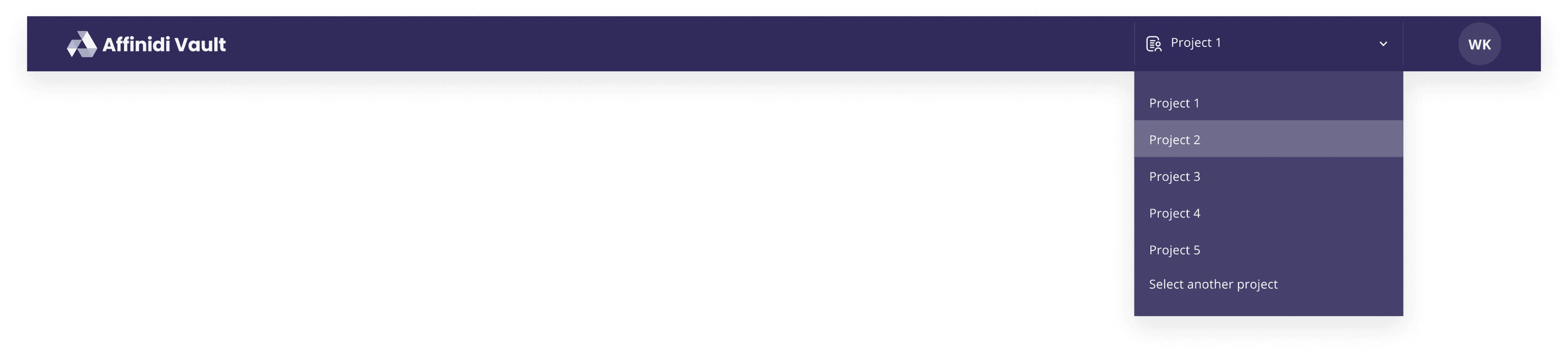
molecUles
Molecules can be created by combining two or more atoms. For instance, an input field and a button can combine to become a search form - below is a selection of molecules from our design system.
Organisms
Multiple molecules together form an organism - examples of an organism are for example, a header, sidebar or signup form
page tEmplates
Templates are the glues that combine the different organisms or individual sections to create a complete design.
white label credential applications
The flexibility of the design system enabled us to reuse it across various applications.
By duplicating the design system and updating the style guide to create a unique look and feel, we significantly reduced the time required to build new applications.
Applications
developer console
This design system was originally created for our developer console. The developer console provides tools to enhance data privacy and portability within the applications of our customers.
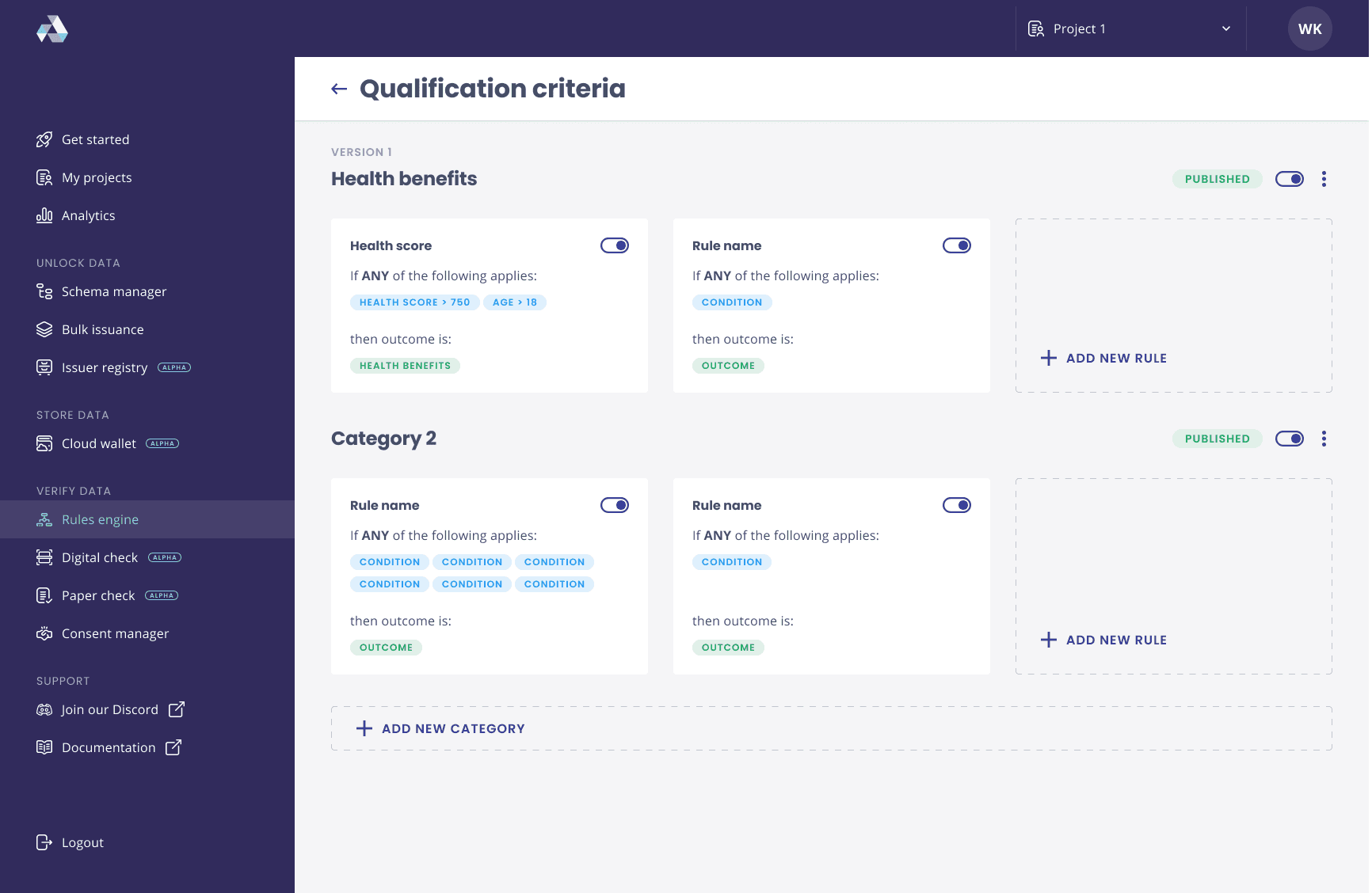
pAges
The highest lever of hierarchy in an atomic design system are the actual pages which makes a product. Below are selection of the pages of our developer portal.
atOms
Atoms are the most basic components. They are the building blocks of a design system such as buttons, lines, shapes, icons, text fields, text labels, etc. - this is a selection of the atoms we used in our design system.
BUTTON
BUTTON
BUTTON
BUTTON
BUTTON
BUTTON
BUTTON
BUTTON
BUTTON
BUTTON
BUTTON
BUTTON
BUTTON
BUTTON
BUTTON
BUTTON
BUTTON
BUTTON
BUTTON
BUTTON
BUTTON
BUTTON
BUTTON
BUTTON
BUTTON
BUTTON
BUTTON
BUTTON
buttons m - variations
TEXT
TEXT
TEXT
TEXT
TEXT
TEXT
TEXT
TEXT
TEXT
TEXT
TEXT
TEXT
TEXT
TEXT
TEXT
TEXT
labels
messages
inputs
selects
building a design system for Affinidi's privacy- preserving applications
A design system is crucial for ensuring consistency, efficiency, and scalability in digital product development. By providing a collection of reusable components and standardised guidelines, it creates a unified visual language and cohesive user experience across different platforms and products.
This not only streamlines the design and development process, reducing redundancy and errors, but also enhances collaboration among teams
Ultimately, a robust design system enables organisations to innovate faster and deliver high-quality products that meet user needs and expectations.
For our design system we used the Atomic Design approach. Atomic design is a methodology composed of five distinct stages working together to create interface design systems in a more deliberate and hierarchical manner. The five stages of atomic design are:
Atoms
Molecules
Organisms
Templates
Pages
design system
design handover
design leadership
responsive design
ux design
ui design
web 3.0
prOject dEtails
COMPANY
affinidi
role
lead product designer
date
2022-2023
link
www.affinidi.com
key responsibilities
Two years after launching Affinidi, we had developed a diverse array of products. Our Berlin team created some, our Singaporean team crafted others, and we built additional products for clients.
Our goal was to unify these varied offerings into a cohesive suite within our developer portal. Naturally, each product had its own distinct look and feel, creating the need for a new, overarching design system.
Integrating these different products into a single, cohesive entity was a significant challenge.
the chAllenge
my rOle
As the Lead Designer on this project, my role was to unify all the diverse products. Having contributed to most of these products in some capacity, I was responsible for harmonising the user experience in the final product.
Additionally, I led the team in designing and developing the various components of the design system and managed the handover to the developers who were building it.

Organisms
Multiple molecules together form an organism - examples of an organism are for example, a header, sidebar or signup form
atOms
Atoms are the most basic components. They are the building blocks of a design system such as buttons, lines, shapes, icons, text fields, text labels, etc. - this is a selection of the atoms we used in our design system.
molecUles
Molecules can be created by combining two or more atoms. For instance, an input field and a button can combine to become a search form - below is a selection of molecules from our design system.
page tEmplates
Templates are the glues that combine the different organisms or individual sections to create a complete design.
pAges
The highest lever of hierarchy in an atomic design system are the actual pages which makes a product. Below are selection of the pages of our developer portal.
stYleguide
The style guide below served as the foundation for our design system. While most elements were predefined, additional elements were incorporated as needed.
BUTTON
BUTTON
BUTTON
BUTTON
BUTTON
BUTTON
BUTTON
BUTTON
BUTTON
BUTTON
BUTTON
BUTTON
BUTTON
BUTTON
BUTTON
BUTTON
buttons m - variations
messages
labels
inputs
selects
TEXT
TEXT
TEXT
TEXT
TEXT
TEXT
TEXT
TEXT
TEXT
TEXT
TEXT
TEXT
TEXT
TEXT
TEXT
TEXT
BUTTON
BUTTON
BUTTON
BUTTON
BUTTON
BUTTON
BUTTON
BUTTON
BUTTON
BUTTON
BUTTON
BUTTON

Applications
developer console
This design system was originally created for our developer console. The developer console provides tools to enhance data privacy and portability within the applications of our customers.
white label credential applications
The flexibility of the design system enabled us to reuse it across various applications.
By duplicating the design system and updating the style guide to create a unique look and feel, we significantly reduced the time required to build new applications.
building a design system for Affinidi's privacy- preserving applications
A design system is crucial for ensuring consistency, efficiency, and scalability in digital product development. By providing a collection of reusable components and standardised guidelines, it creates a unified visual language and cohesive user experience across different platforms and products.
This not only streamlines the design and development process, reducing redundancy and errors, but also enhances collaboration among teams
Ultimately, a robust design system enables organisations to innovate faster and deliver high-quality products that meet user needs and expectations.
For our design system we used the Atomic Design approach. Atomic design is a methodology composed of five distinct stages working together to create interface design systems in a more deliberate and hierarchical manner. The five stages of atomic design are:
Atoms
Molecules
Organisms
Templates
Pages
prOject dEtails
COMPANY
affinidi
role
lead product designer
date
2022-2023
link
www.affinidi.com
key responsibilities
design system
design handover
design leadership
responsive design
ux design
ui design
web 3.0
Two years after launching Affinidi, we had developed a diverse array of products. Our Berlin team created some, our Singaporean team crafted others, and we built additional products for clients.
Our goal was to unify these varied offerings into a cohesive suite within our developer portal. Naturally, each product had its own distinct look and feel, creating the need for a new, overarching design system.
Integrating these different products into a single, cohesive entity was a significant challenge.
the chAllenge
my rOle
As the Lead Designer on this project, my role was to unify all the diverse products. Having contributed to most of these products in some capacity, I was responsible for harmonising the user experience in the final product.
Additionally, I led the team in designing and developing the various components of the design system and managed the handover to the developers who were building it.
Organisms
Multiple molecules together form an organism - examples of an organism are for example, a header, sidebar or signup form
atOms
Atoms are the most basic components. They are the building blocks of a design system such as buttons, lines, shapes, icons, text fields, text labels, etc. - this is a selection of the atoms we used in our design system.
molecUles
Molecules can be created by combining two or more atoms. For instance, an input field and a button can combine to become a search form - below is a selection of molecules from our design system.
page tEmplates
Templates are the glues that combine the different organisms or individual sections to create a complete design.
Applications
developer console
This design system was originally created for our developer console. The developer console provides tools to enhance data privacy and portability within the Web 3.0 applications of our customers.
white label credential applications
The flexibility of the design system enabled us to reuse it across various applications.
By duplicating the design system and updating the style guide to create a unique look and feel, we significantly reduced the time required to build new applications.


pages
The highest lever of hierarchy in an atomic design system are the actual pages which makes a product. Below are selection of the pages of our developer portal.
stYleguide
The style guide below served as the foundation for our design system. While most elements were predefined, additional elements were incorporated as needed.
BUTTON
BUTTON
BUTTON
BUTTON
BUTTON
BUTTON
BUTTON
BUTTON
BUTTON
BUTTON
BUTTON
BUTTON
BUTTON
BUTTON
BUTTON
BUTTON
buttons m - variations
messages
labels
inputs
selects
TEXT
TEXT
TEXT
TEXT
TEXT
TEXT
TEXT
TEXT
TEXT
TEXT
TEXT
TEXT
TEXT
TEXT
TEXT
TEXT
BUTTON
BUTTON
BUTTON
BUTTON
BUTTON
BUTTON
BUTTON
BUTTON
BUTTON
BUTTON
BUTTON
BUTTON

contact me
connect
me@wernersdesigns.com
©️ werner van huffelen, 2024 all rights reserved
lEt's cOnnect ✌️

lEt's cOnnect ✌️
lEt's cOnnect ✌️

let's connect ✌️
let's connect ✌️

lEt's cOnnect ✌️
lEt's cOnnect ✌️
building a design system for Affinidi's privacy- preserving applications
A design system is crucial for ensuring consistency, efficiency, and scalability in digital product development. By providing a collection of reusable components and standardised guidelines, it creates a unified visual language and cohesive user experience across different platforms and products.
This not only streamlines the design and development process, reducing redundancy and errors, but also enhances collaboration among teams
Ultimately, a robust design system enables organisations to innovate faster and deliver high-quality products that meet user needs and expectations.
For our design system we used the Atomic Design approach. Atomic design is a methodology composed of five distinct stages working together to create interface design systems in a more deliberate and hierarchical manner. The five stages of atomic design are:
Atoms
Molecules
Organisms
Templates
Pages
prOject dEtails
COMPANY
affinidi
role
lead product designer
date
2022-2023
link
www.affinidi.com
key responsibilities
design system
design handover
design leadership
responsive design
ux design
ui design
web 3.0
Two years after launching Affinidi, we had developed a diverse array of products. Our Berlin team created some, our Singaporean team crafted others, and we built additional products for clients.
Our goal was to unify these varied offerings into a cohesive suite within our developer portal. Naturally, each product had its own distinct look and feel, creating the need for a new, overarching design system.
Integrating these different products into a single, cohesive entity was a significant challenge.
the chAllenge
my rOle
As the Lead Designer on this project, my role was to unify all the diverse products. Having contributed to most of these products in some capacity, I was responsible for harmonising the user experience in the final product.
Additionally, I led the team in designing and developing the various components of the design system and managed the handover to the developers who were building it.

stYleguide
The style guide below served as the foundation for our design system. While most elements were predefined, additional elements were incorporated as needed.
Organisms
Multiple molecules together form an organism - examples of an organism are for example, a header, sidebar or signup form
atOms
Atoms are the most basic components. They are the building blocks of a design system such as buttons, lines, shapes, icons, text fields, text labels, etc. - this is a selection of the atoms we used in our design system.
molecUles
Molecules can be created by combining two or more atoms. For instance, an input field and a button can combine to become a search form - below is a selection of molecules from our design system.
buttons m - variations
messages
labels
inputs
selects
BUTTON
BUTTON
BUTTON
BUTTON
BUTTON
BUTTON
BUTTON
BUTTON
BUTTON
BUTTON
BUTTON
BUTTON
BUTTON
BUTTON
BUTTON
BUTTON
TEXT
TEXT
TEXT
TEXT
TEXT
TEXT
TEXT
TEXT
TEXT
TEXT
TEXT
TEXT
TEXT
TEXT
TEXT
TEXT
BUTTON
BUTTON
BUTTON
BUTTON
BUTTON
BUTTON
BUTTON
BUTTON
BUTTON
BUTTON
BUTTON
BUTTON
page tEmplates
Templates are the glues that combine the different organisms or individual sections to create a complete design.
Applications
developer console
This design system was originally created for our developer console. The developer console provides tools to enhance data privacy and portability within the applications of our customers.
white label credential applications
The flexibility of the design system enabled us to reuse it across various applications.
By duplicating the design system and updating the style guide to create a unique look and feel, we significantly reduced the time required to build new applications.
pAges
The highest lever of hierarchy in an atomic design system are the actual pages which makes a product. Below are selection of the pages of our developer portal.

lEt's cOnnect ✌️
lEt's cOnnect ✌️
TAGS
design system
design leadership
design handover
responsive design
ux design
ui design
web 3.0
company
affinidi
role
lead product designer
date
2022-2023
link
www.affinidi.com
prOject dEtails
Two years after launching Affinidi, we had developed a diverse array of products. Our Berlin team created some, our Singaporean team crafted others, and we built additional products for clients.
Our goal was to unify these varied offerings into a cohesive suite within our developer portal. Naturally, each product had its own distinct look and feel, creating the need for a new, overarching design system.
Integrating these different products into a single, cohesive entity was a significant challenge.
the chAllenge
my rOle
As the Lead Designer on this project, my role was to unify all the diverse products. Having contributed to most of these products in some capacity, I was responsible for harmonising the user experience in the final product.
Additionally, I led the team in designing and developing the various components of the design system and managed the handover to the developers who were building it.
building a design system for Affinidi's privacy- preserving applications
A design system is crucial for ensuring consistency, efficiency, and scalability in digital product development. By providing a collection of reusable components and standardised guidelines, it creates a unified visual language and cohesive user experience across different platforms and products.
This not only streamlines the design and development process, reducing redundancy and errors, but also enhances collaboration among teams
Ultimately, a robust design system enables organisations to innovate faster and deliver high-quality products that meet user needs and expectations.
For our design system we used the Atomic Design approach. Atomic design is a methodology composed of five distinct stages working together to create interface design systems in a more deliberate and hierarchical manner. The five stages of atomic design are:
Atoms
Molecules
Organisms
Templates
Pages
stYleguide
The style guide below served as the foundation for our design system. While most elements were predefined, additional elements were incorporated as needed.
buttons m - variations
messages
labels
inputs
selects
BUTTON
BUTTON
BUTTON
BUTTON
BUTTON
BUTTON
BUTTON
BUTTON
BUTTON
BUTTON
BUTTON
BUTTON
BUTTON
BUTTON
BUTTON
BUTTON
TEXT
TEXT
TEXT
TEXT
TEXT
TEXT
TEXT
TEXT
TEXT
TEXT
TEXT
TEXT
TEXT
TEXT
TEXT
TEXT
BUTTON
BUTTON
BUTTON
BUTTON
BUTTON
BUTTON
BUTTON
BUTTON
BUTTON
BUTTON
BUTTON
BUTTON
atOms
Atoms are the most basic components. They are the building blocks of a design system such as buttons, lines, shapes, icons, text fields, text labels, etc. - this is a selection of the atoms we used in our design system.


Multiple molecules together form an organism - examples of an organism are for example, a header, sidebar or signup form.
Organisms
Applications
applications
This design system was originally created for our developer console. The developer console provides tools to enhance data privacy and portability within the applications of our customers.
developer console
molecUles
Molecules can be created by combining two or more atoms. For instance, an input field and a button can combine to become a search form - below is a selection of molecules from our design system.

The flexibility of the design system enabled us to reuse it across various applications.
By duplicating the design system and updating the style guide to create a unique look and feel, we significantly reduced the time required to build new applications.
white label credential applications
lEt's cOnnect ✌️
lEt's cOnnect ✌️
page tEmplates
Templates are the glues that combine the different organisms or individual sections to create a complete design.
page templates
Templates are the glues that combine the different organisms or individual sections to create a complete design.
pAges
The highest lever of hierarchy in an atomic design system are the actual pages which makes a product. Below are selection of the pages of our developer portal.